Welcome!
We’re proud to reveal that the soft launch of this new marketing website is now live! This is a beta test launch which is designed to span the days before our full-blown migration next Tuesday (Feb. 13). Without getting into excessive detail, the majority of our traffic will still be served the existing (old) site: we are using Feb. 6-13 to test performance with select audiences.
Click on the company logo in the top left-hand corner to view the homepage.
How You Can Get Back to the Old Site (For Now)
When you next log onto creditriskmonitor.com, at the very top you will see a blue banner asking you if you would like to experience the new site. Clicking on the bold text will bring you there. (NOTE: The ability to do this goes away after the full launch next week.)

Conversely, if you are on new site and you’re wanting to toggle back to the old one to see the contrast, we offer that capability as well:

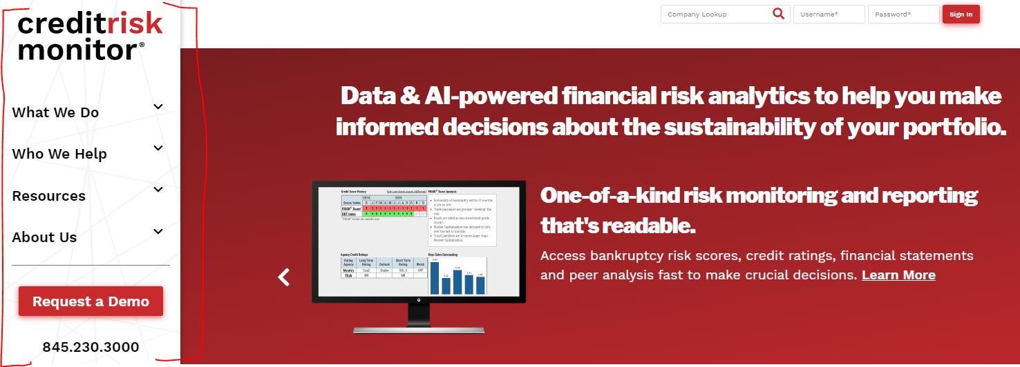
Off to the Side
You'll also be keen to learn that the navigation for the site is now a sidebar, rather than running along the top. Observe the "before..."

...and "after!"
Subscriber Login
Anticipating notes on the matter, the login and company lookup for existing subscribers/trials should be seamless from the old site to the new - the only change they will see is an aesthetic one. In fact, the user won’t even need to click on the heading to expand the input field so we’ve made it simpler.
Old

New

In general, we’ve opted for a simpler, more direct approach which speaks more to problem solving for our customers rather than heaping information and solutions on them.
- Instead of highlighting the FRISK® Score, FRISK® Stress Index, PAYCE® score, Financial Statement Processing, etc. painstakingly on their own individual web pages, we aligned under relevant headings, e.g. “Public Company Risk Analysis” and “Private Company Risk Analysis.” In doing so, we’re making the points that:
- This distinction is important and our customers should be considering it, teeing things up for the reps
- No one solution is the “silver bullet” – the ideal customer looks at dangers in all parts of his/her portfolio and uses a variety of our tools to maximize value
The site is designed with the prospect in mind: they may know little, if anything, about us when they arrive. The goal is to tell a straightforward story: What we do. Who we help. Why we're worth your [limited] time.
We think that also translates to people further down the funnel, and even to our existing clients. Too often, it seems we walk away amazed at what people already paying us *don't* know about our key offerings - and tell us as much with little prodding. Never forget that the marketing site can be a wonderful resource for re-introducing someone to our universe. We all can use a refresher from time to time.

It’s taken a tremendous amount of planning, preparation and execution to get to this destination and I wanted to give special thanks to our developers at Hot Sauce who made the dream a reality, my department – Cathy Fowlkes, Robert Raniolo and Brian Sanders – as well as the members of the Leadership team, our initial internal (Rob Badstein, Michael Contento, Renee Lyons) and external (Gregg Brewer, Garrett Kowalsky) testers. You all had a hand in this victory.
Now, back to work. Let the demo requests pour in!
-- Nicholas


